Foods, journeys, tales of chefs and more
There are settings in which the process of innovation is a pendant that oscillates between aesthetics and functionality: at what point should it be stopped?
What you find here is a history of design, a story that speaks of alignment between technique and expression, a history of form that follows function. The artistic director of a company with a strong technological trait has an obligation to be a chimera or, at worst, a minotaur: a subject that participates in more or less equal parts to two worlds, often incompatible. A “monstrum”, as the Latins called it, a “miracle”, something that does not belong to either of the two worlds and causes both fear and amazement.
Imagine then to be the artistic director of a company that creates cooking suites, professional and customized cooking blocks for the market’s highest level, which in most cases are included in open view kitchen projects. They are instruments of high precision dedicated to the best chefs, and that must also be aesthetically satisfying to suit cutting edge facilities, attended by customers with prominent aesthetic judgment.
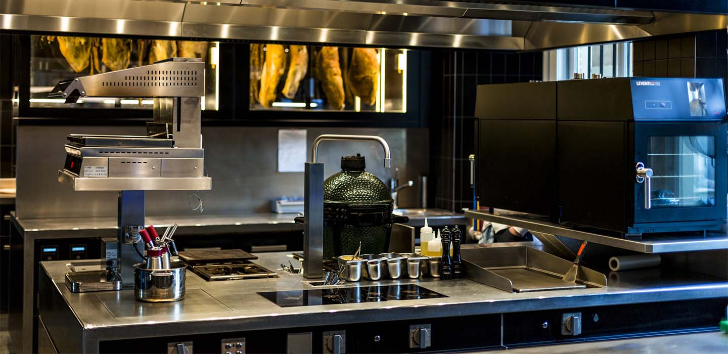
If you were that artistic director, which reason would you consider valid for disrupting the life of a product team, pushing it to rethink a process entirely and to alter an operating path? The answer might be “whatever triggers an alarm on the aesthetic level”; or “anything that can bring a functional improvement”.
The person that you should imagine stands in the middle, and would say “every useless aesthetic element must be a reason for bringing a functional improvement, producing at the same time an aesthetic rebalance”.
Can an “inadequate” faucet, a piece of good craftsmanship and functionality, but aesthetically inappropriate in the context of the cooking suite, be a good reason to rethink the whole process? It is, however, a high range product, made with outstanding materials, and in line with the state of the art of the market.
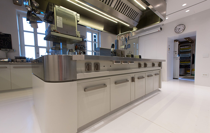

You can see it, mounted on the prototype of an island-shaped cooking suite. It is made of excellent chrome-plated brass and has an enduring and tested internal mechanism. Yet it disturbs the eye, like a room of the house tidied up by someone else, in which something is missing, but you are unable to understand what is. Its arched pipe clashes with the clean and regular elements of the cooking suite; its traditional round knobs do not suit the kitchen’s contours, and its connection to the top looks messy.
That faucet is placed like a pair of out of fashion trousers, like a drumbeat out of tune and you just can’t accept it. The most professional part inside of you begins to wonder whether it is really necessary to keep it or not. It reaches the roots of the concept of a faucet in the kitchen, it thinks and thinks back on how a chef should use it.
The first pieces of the puzzle settle in place when you realize that in an island kitchen, the pipe does not find obstacles when rotating it by 360 degrees,and it could ideally turn to pour water on a functioning fryer placed next to it. Immediately after you notice that to open the faucet, the Chef or a member of his brigade need to lean over to reach the knobs. It the sometimes frenetic action of the kitchen, they may have to extend their arm over the burners, through cooking pots, or simply stand in an uncomfortable position.
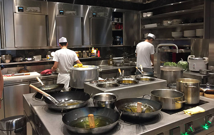
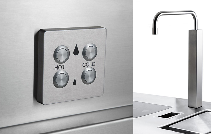
Function always returns; and since form follows function, everything returns: it is the right moment to rethink its shape, by also considering function.
When the idea becomes clear, get some technicians out of bed: it’s half-past eleven at night, but the idea can’t wait. You may be cursed, it’s part of the game, but immediately after you think “why not?”. The following morning there is a full team at work, there are questions flooding in, and people running between departments.
The chief designer asks, almost talking to himself:
In the cooking suite in front of you, everything is designed for maximum ergonomics: the knobs of cooking functions are vertical to the top, they face the operator in order to adapt to the natural movement of the wrist. At the same time, however, they have a graduated scale marked by laser, in order to always give an accurate view of the firepower and a micrometric snap mechanism that allows the chef to “feel” how many degrees the knob is rotating.
The solution is right in front of your eyes: the faucet should have a single knob/mixer on the dashboard, next to the knobs of the cooking functions; commands must all be in the same area, all reachable and controllable by the same position, or requiring just minimal movements. For customers who request it, an electronic control panel with four buttons must also be available. Form follows function: the faucet’s knob takes its place in a tidy set of commands, all coordinated on the aesthetic level, all aligned from the formal point of view and possibly on both sides of the cooking block. The rotary knob of the mixer must withstand damages, stay open without interfering with movements, and must have a safety catch to prevent its opening by mistake.
The rod must be mobile but controllable.
Someone says: “we must place it higher so as not to interfere with the operations that take place on the cooking tops”. Someone else adds: “Ok, but not so much to interfere with the pot rack”.
One of the vertical elements appears on the top of the cooking suite. The technician who brought it says “these are all squared, perhaps we can adapt one for raising the rod”.
You realize that to apply the rise immediately returns the faucet’s tower to the formal balance: no curve in the midst of the linear and angular elements of the assembly. Still, form follows function. And everything will be produced in an even better metal: stainless steel.
The last step is the rod: it must reach all areas on the cooking suite. Therefore it’s clear that it has to be extended, it should be longer than the previous faucet. This finally gives to the tap that prominent aspect that it requires: the headlight or the windscreen of a motorcycle, the grid of a car’s hood, the gun of a tank. However, length increases the risk of splashing water in dangerous points.
“Let’s apply blocks” is the idea that comes out and makes the most sense. Adjustable blocks are inserted inside the tower: from the joint of the rod, it is possible to lock its rotation arch, deciding which points should be reached and which not.
This is where form becomes function. The metamorphosis is complete. Ars Addit Naturae.
If you were that creative director, or one of the team members, you would have just witnessed the birth of MFons, the source that brings water in a Marrone cooking suite; the result of a transformation process not dissimilar to nature when selecting forms for their functionality. A transformation method which, however, is the result of the human mind and eye, of his capacity to fit solutions into reality thanks to the careful consideration of the rules that those realities govern.
Modulo di integrazione con Mailchimp